Before You Begin
Consider the following question before you read further:
Given a screen reader cannot recognize text colour, how would you change instructions in the exercise shown below.
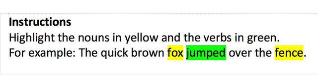
In the following sentence, highlight the nouns in yellow and the verbs in green:
The quick brown fox jumped over the fence.
Fonts
Font choice in terms of Font Family and Font Size are important to consider for people who have reduced vision or who have perceptual challenges and who don’t use a screen reader.
Screen readers do not interpret font family or font size for plain text. Larger fonts may be used for headings but if not coded as a “Heading” then a screen reader will not pick up (see Headings page). Clear, well-spaced text makes it much easier for everyone to interpret especially if reading on a screen. Avoid adding text over printed backgrounds as it is difficult to distinguish the identifying edges of the letters..
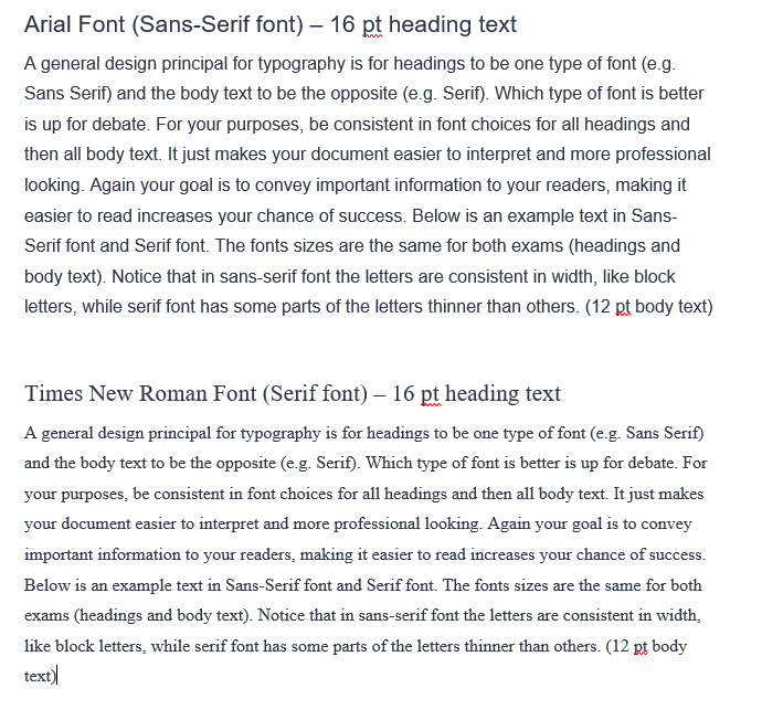
A general design principal for typography is for headings to be one type of font (e.g. Sans Serif) and the body text to be the opposite (e.g. Serif). Which type of font is better is up for debate. For your purposes, be consistent in font choices for all headings and then all body text. It just makes your document easier to interpret and more professional looking. Again your goal is to convey important information to your readers, making it easier to read increases your chance of success. Below is an example text in Sans-Serif font and Serif font. The fonts sizes are the same for both exams (headings and body text). Notice that in sans-serif font the letters are consistent in width, like block letters, while serif font has some parts of the letters thinner than others.
For more about the difference in sans-serif and serif font for text in print, see Fonts.com.
Colour
Colour can be used to convey information such as in a figure or to create visual interest such as in a slide deck. When creating content, you are often making choices on text colours, backgrounds, fills for areas etc. Colour perception issues are one of the most common visual issues so your colour choices have direct impact on your students understanding your material and, in some cases, even seeing your material.
Colour perception issues can range from complete colour blindness to selective colour perception. People may also have contrast perception issues. Screen readers to not recognize colour so it is important to indicate in text (e.g., words) where colour has means. The following are some general best practices for colour.
Screen Reader
Given that screen readers do not recognize colour, when using colour for a purpose ensure you add text as well.
See the following example of using different colour highlighters to indicate different elements of a sentence.
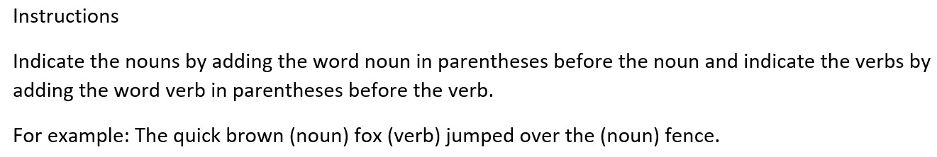
Below is an example of how to write the instructions in a more accessible way by using text such as (noun) or (verb) before the words that they describe.
Contrast
Always go for high contrast between foreground and background elements. Typical black text on a white background is high contrast as is the inverse of white text on a black background. When you choose something other than white or black then you have to be careful to ensure high contrast is retained.
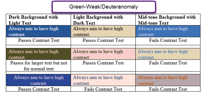
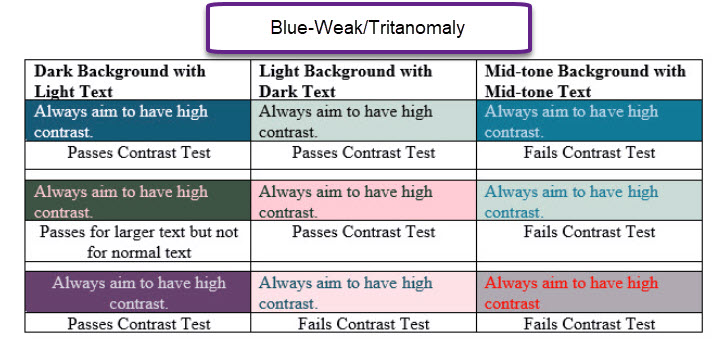
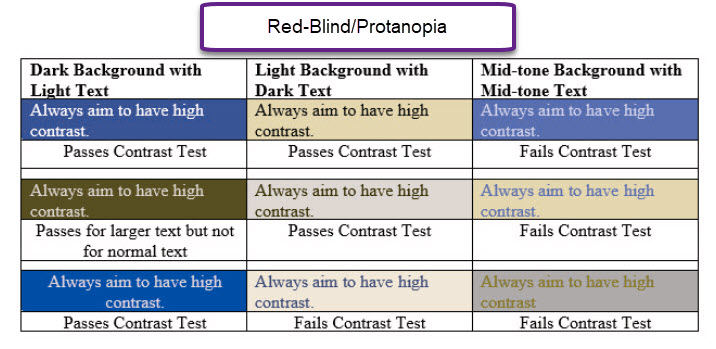
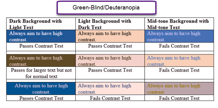
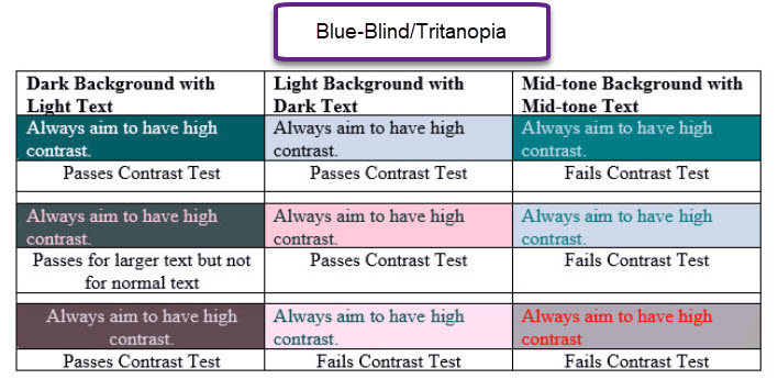
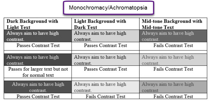
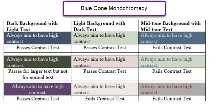
The following gallery provides a simulation of how people with different colour perception conditions would perceive a range of colours in background and text. Each colour combination (text and background) was checked with a contrast checker and the result is listed directly under the cell. As you click through slides note how both colour and contrast changes depending on the vision issue (e.g. red weak, or green week). Contrast checker used was WebAIM: Contrast Checker while Colour Blindness simulations were run on Coblis – Color Blindness Simulator.
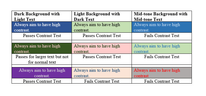 Original created table: no filter
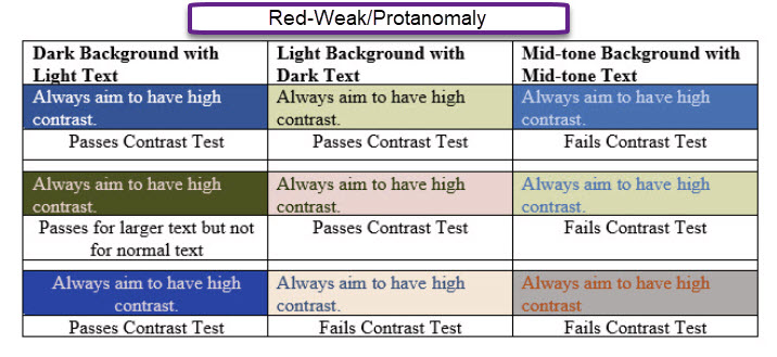
Differentiation by Colour
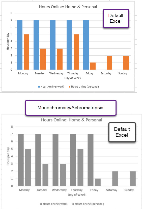
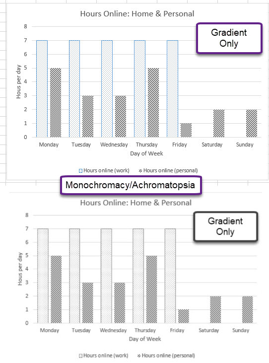
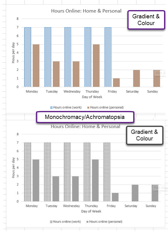
If colour is being used to convey information such as on a graph or a map, then pattern should be added as well. Excel charts would be a good example of where you might need to consider adjusting the default settings. The following Gallery shows a “default colour scheme” for a chart in Excel and how it would be perceived by someone who is colour blind and then two examples of refinements that could be made and corresponding impact. Colour Blindness simulations were run on Coblis – Color Blindness Simulator.
Test Your Understanding
Now that you have read the fonts and colour material answer the following question: