Before You Begin
Consider the following question before you read further:
How would you the hyperlinks shown in the list below more accessible for a screen reader?

Introduction
While the hyperlink is a fundamental building block of the world wide web and has been commonly used since the early 1990’s, the typical use of the hyperlink has often lagged as far as accessibilty.
By definition a hyperlink links on document to additional material posted on the web.
There are three parameters to a hyperlink:
- Visually a hyperlink is given a specific style so we know how to identify that there is something to follow.
- The URL or destination where the hyperlink will take you, for example https:\\tru.ca.
- The actual text you see on the page or screen to indicate the hyperlink for example Thompson Rivers University website.
The style of the hyperlink is covered under the Fonts & Colour page with one additional caveat that if your document is meant to be printed and you are showing raw urls (see below) then you should not use an underline as your hyperlink style.
The destination should be evaluated in terms of its content and accessibility (i.e,. if you link to a YouTube video, does the video have an accurate transcript or captions). Your text should make it clear to all users on what additional information is provided at the link destination. Do not send a user to a web site without providing some information about what is important on that site.
The final piece is the actual text of the hyperlink. Hyperlinks are directional elements that screen readers can recognize much like headings. A screen reader can scan through a document just locating hyperlinks. A screen reader identifies a “link” and then reads the VISIBLE linked text to help user to understand what the link is about. If your visible text does not provide any useful information OR if it is just a raw hyperlink then your end user will have a hard time understanding the prupose of the link. A person using a screen reader may not hear the text before the hyperlink as they may be searching just links to follow on your page (a screen reader can be asked to read all the links on a page so user can just quickly scan content)
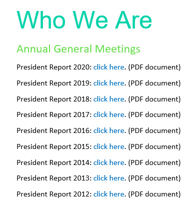
The image below provides a common use of hyperlinks. If you asked a screen reader to navigate through the following links then all you would hear would be “link click here”.
Below are some best practices to make your hyperlinks more accessible. Following these guidelines will make your content clearer for all users.
Best Practices
- The linked text should be unique on a page, i.e. do not link to the same text again like shown in example above.
- The linked text should be meaningful, and it does not have to be short!
If sending someone to a website, name the site. If you are linking to an article, you can link to author, title and journal. There are very few limits on length of that visible text. The one exception is Microsoft excel which limits cell contents to 255 characters and that would be the limit for your text. If you are using government sources, then your linked text and surround text should be clear on where you are directing your reader, so the reader can search for the document based on your description. Government websites change links and naming frequently.
- If the document is to be both used as a digital document and a printed one then you may want to show the actual URL so someone can follow it or for citation purposes. But be honest with yourself, how many complex URL’s do you type out when using the web? Most are more likely to use a search engine to get there.
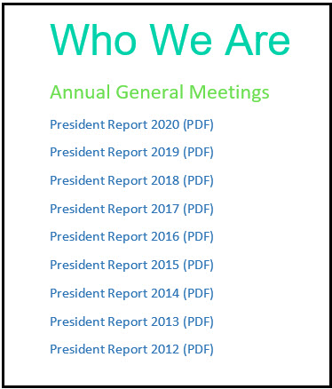
To make the example above more accessible you could link to each document title as follows:
Test Your Understanding
Now that you have read the hyperlinks material answer the following question: